


Prepping for my lecture on Monday, I plotted this graph of the Cyclically Adjusted Price Earnings (CAPE) ratio against the 10 year Treasury yield.
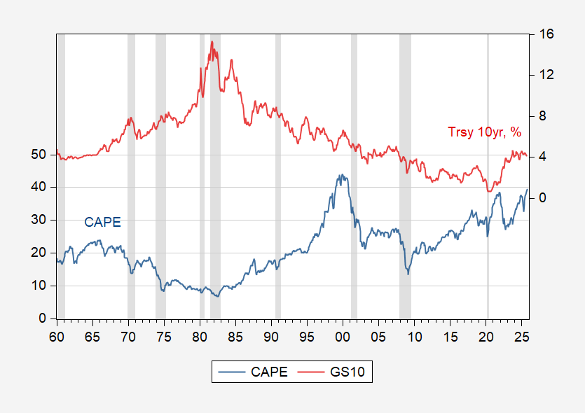
Figure 1: Standard and Poor Cyclically Adjusted Price Earnings (CAPE) ratio (left scale), and ten year interest rate (right scale). Source: Robert Shiller, accessed 10/10/2025
However, the Trump-inspired sell-off today should begin the process of bringing the price/earnings ratio in line with fundamentals, at least for the Magnificent-7.
Source link

